

Visual Identities
Visual Identities
Corporate Communications
Corporate
Communications
Branding
Cohesive visual identities that align with your mission and bring your brand to life
SERVICES
Art Direction - Branding - Illustration - Motion Graphics
While we’ve specialised in working within brand guidelines, we also love creating them from the ground up. There’s nothing quite like receiving a fresh brief and building a whole new identity from scratch to get our creative gears turning. On this page, we showcase branding projects that reflect the way we design here at Morango. Sustainability, customisation, and illustration are everyday themes for us, and with that in mind, we’ve selected the projects that best capture the human touch and originality we believe every new brand should carry.
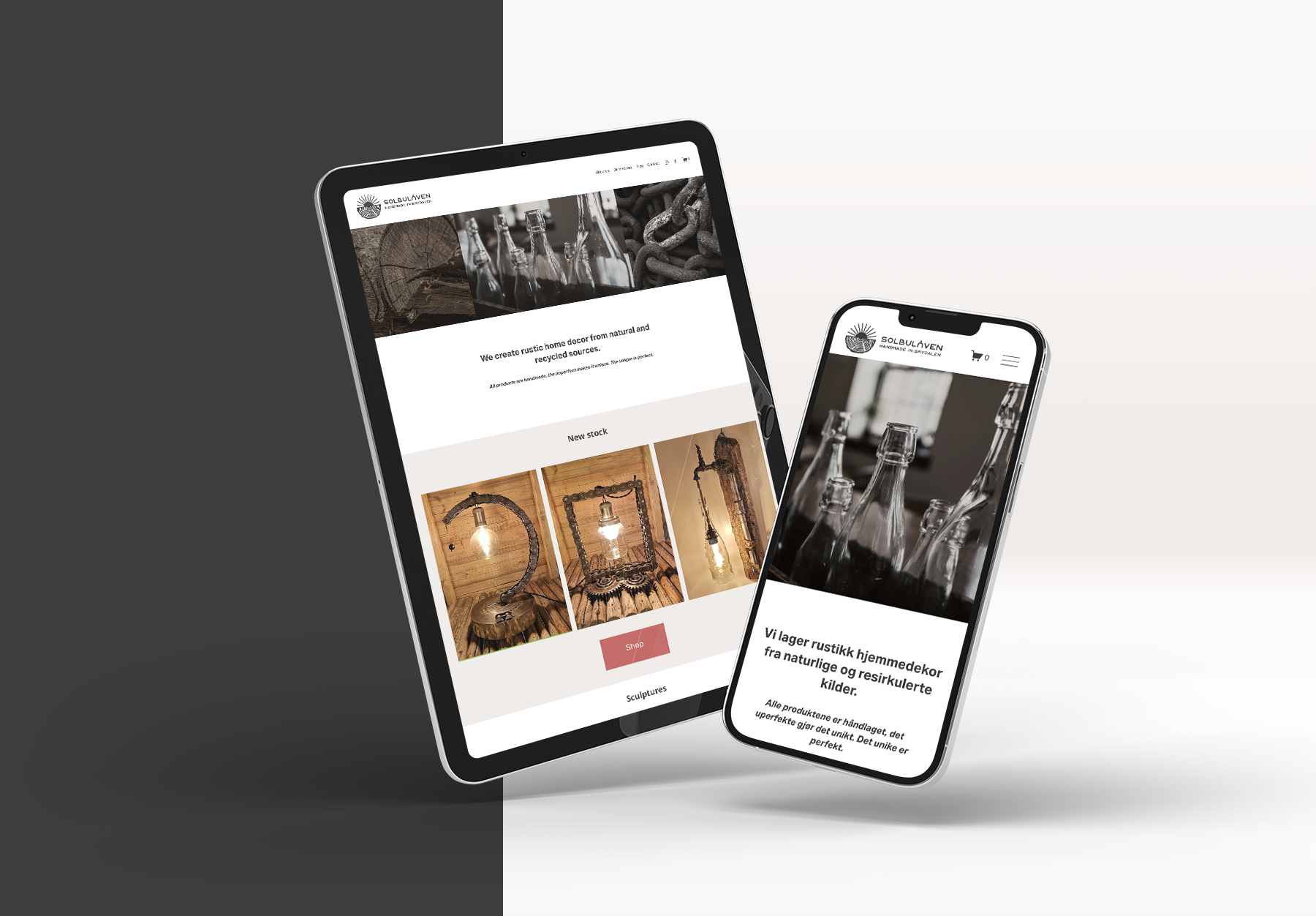
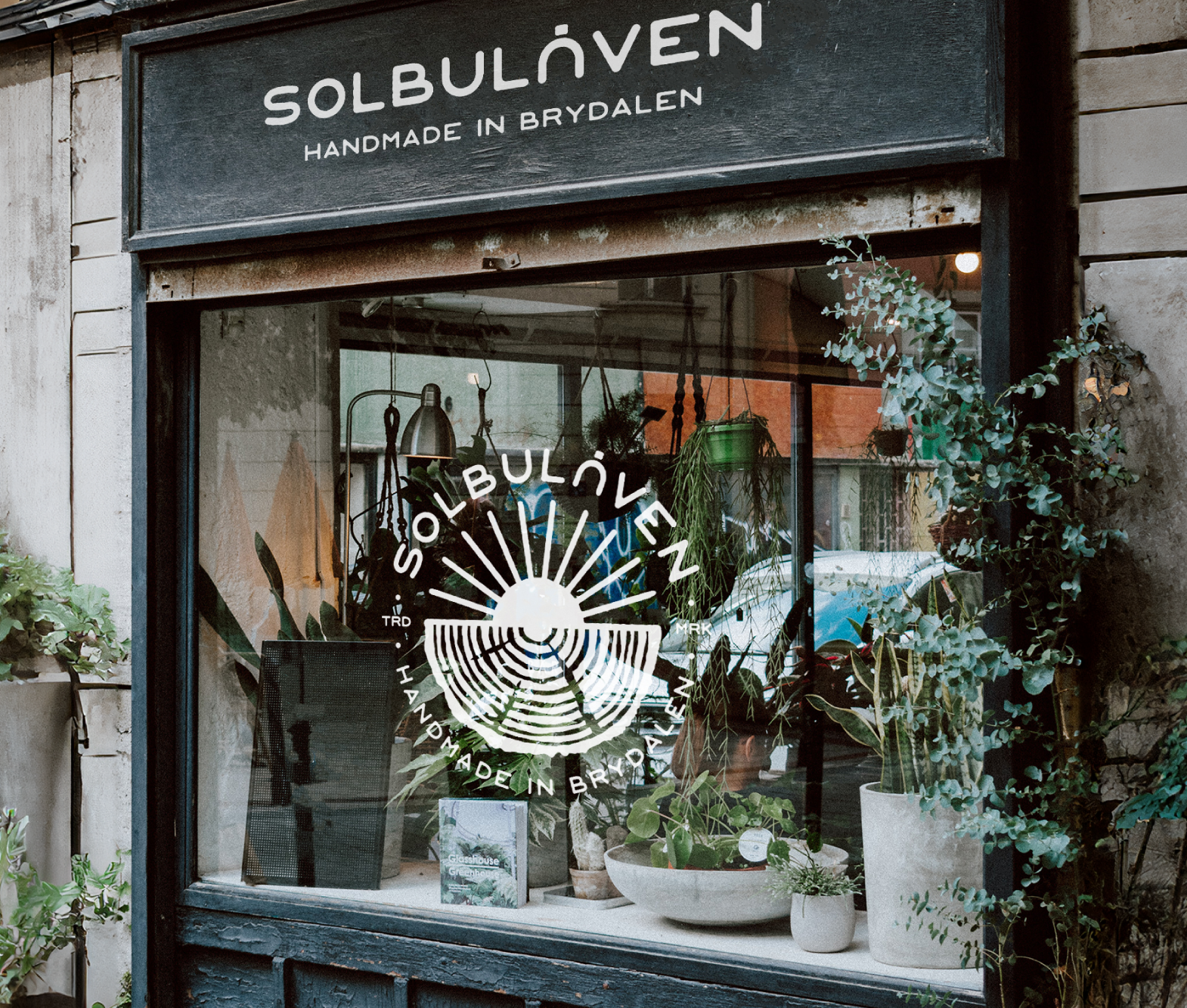
Solbulåven
A family-run Norwegian business that crafts home décor from recycled materials. Everything is made in their barn, 'Solbu,' in the remote village of Brydalen in Eastern Norway. The name means sunny place, perfectly reflecting their rustic yet refined creations. We designed a logo that celebrates their detailed craftsmanship while staying simple and versatile, built around two core themes: the sun and wood.
Beyond its digital use, the logo also lives physically—hot-stamped onto wooden products, featured on tags, and displayed in their store. To give them flexibility, we developed an eclectic logo set that adapts seamlessly to different contexts.


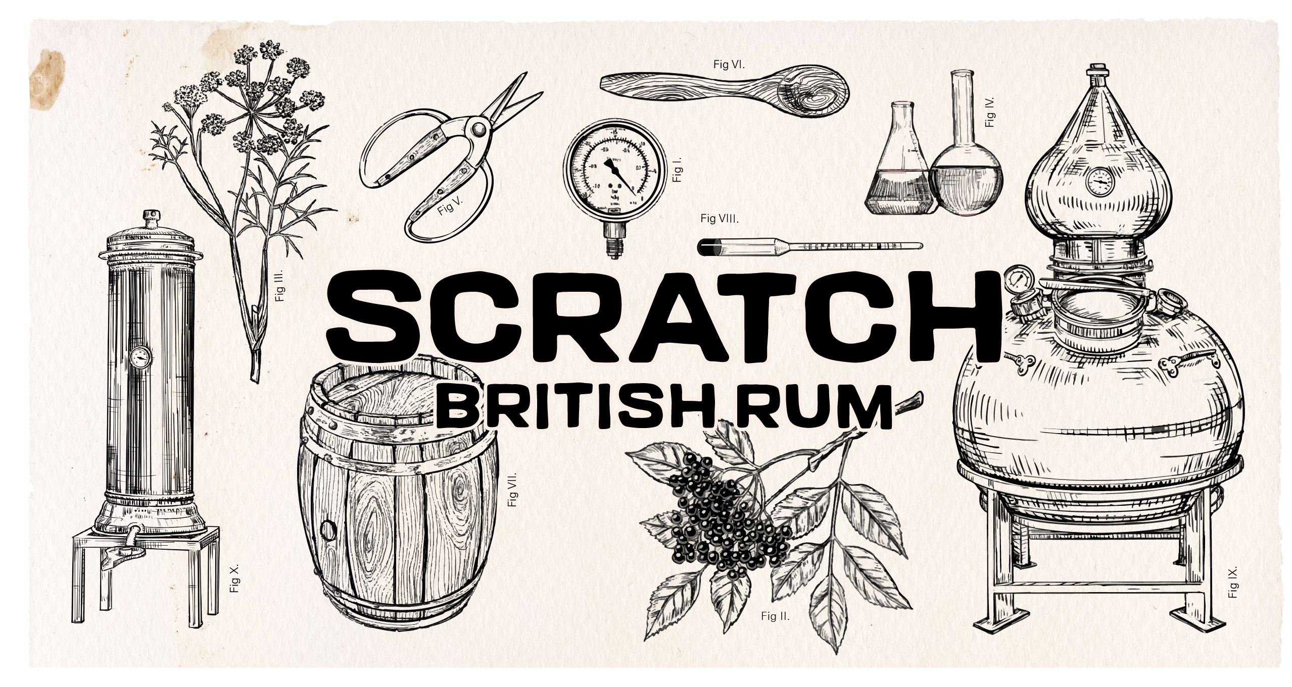
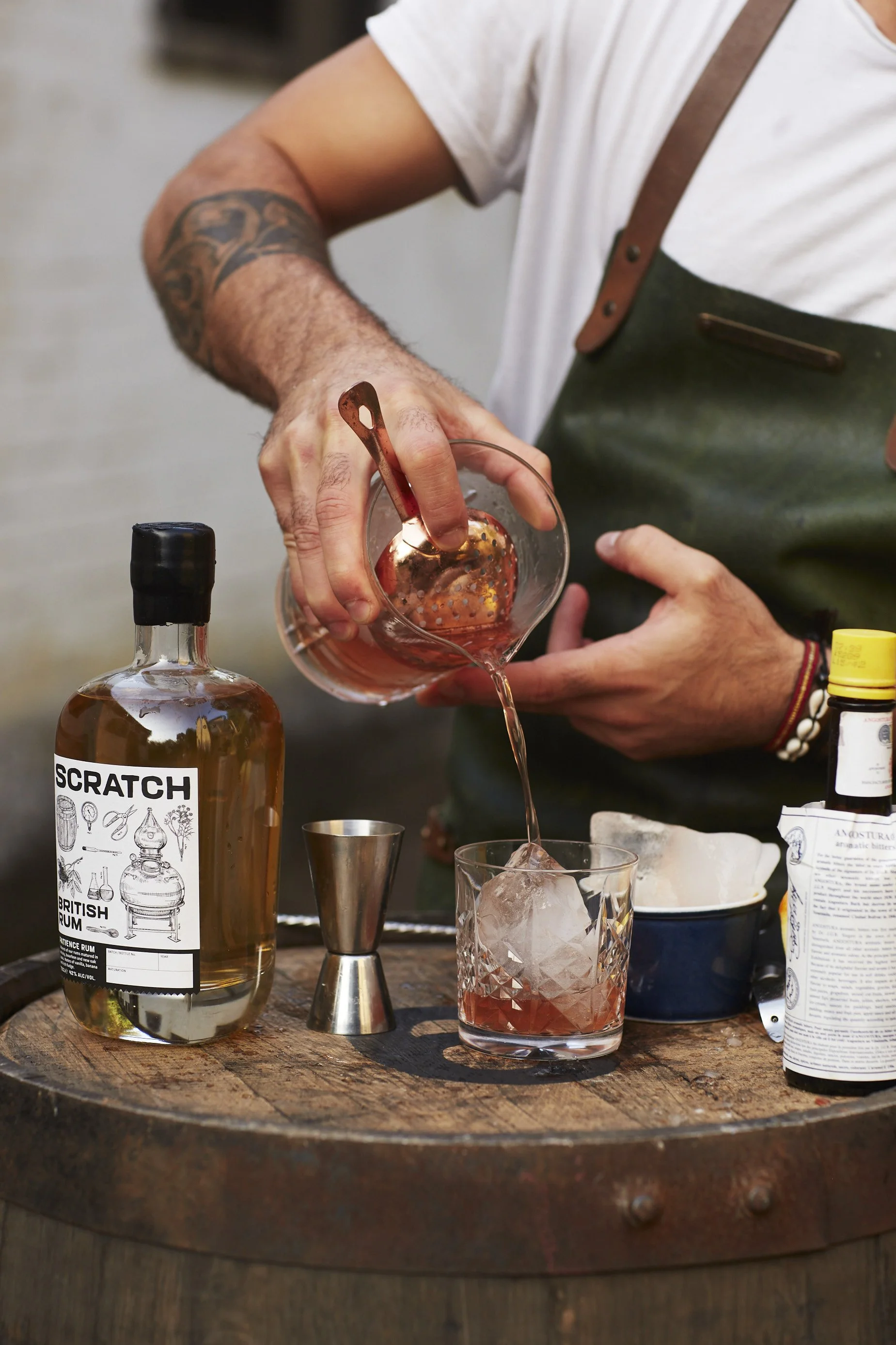
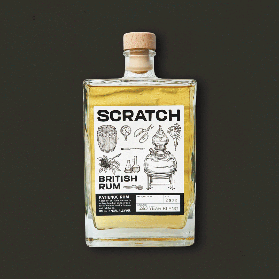
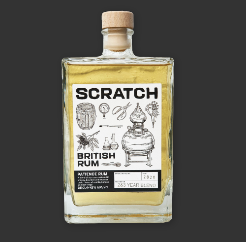
Scratch British Rum
Scratch first approached us in 2018, marking the beginning of a journey of discovery for both their product and their brand identity. As one of the very first rum distilleries in the UK, proudly based in Hertfordshire, their core message was clear: everything was crafted locally, entirely from scratch, on British soil.
We translated that vision into a playful yet refined label with a botanical feel, supported by a flexible colour palette that adapts across their range of rum flavours. Since then, Scratch has gone on to make history—becoming the first British-distilled rum to win a medal in the aged rum category at the International Wine & Spirits Competition.
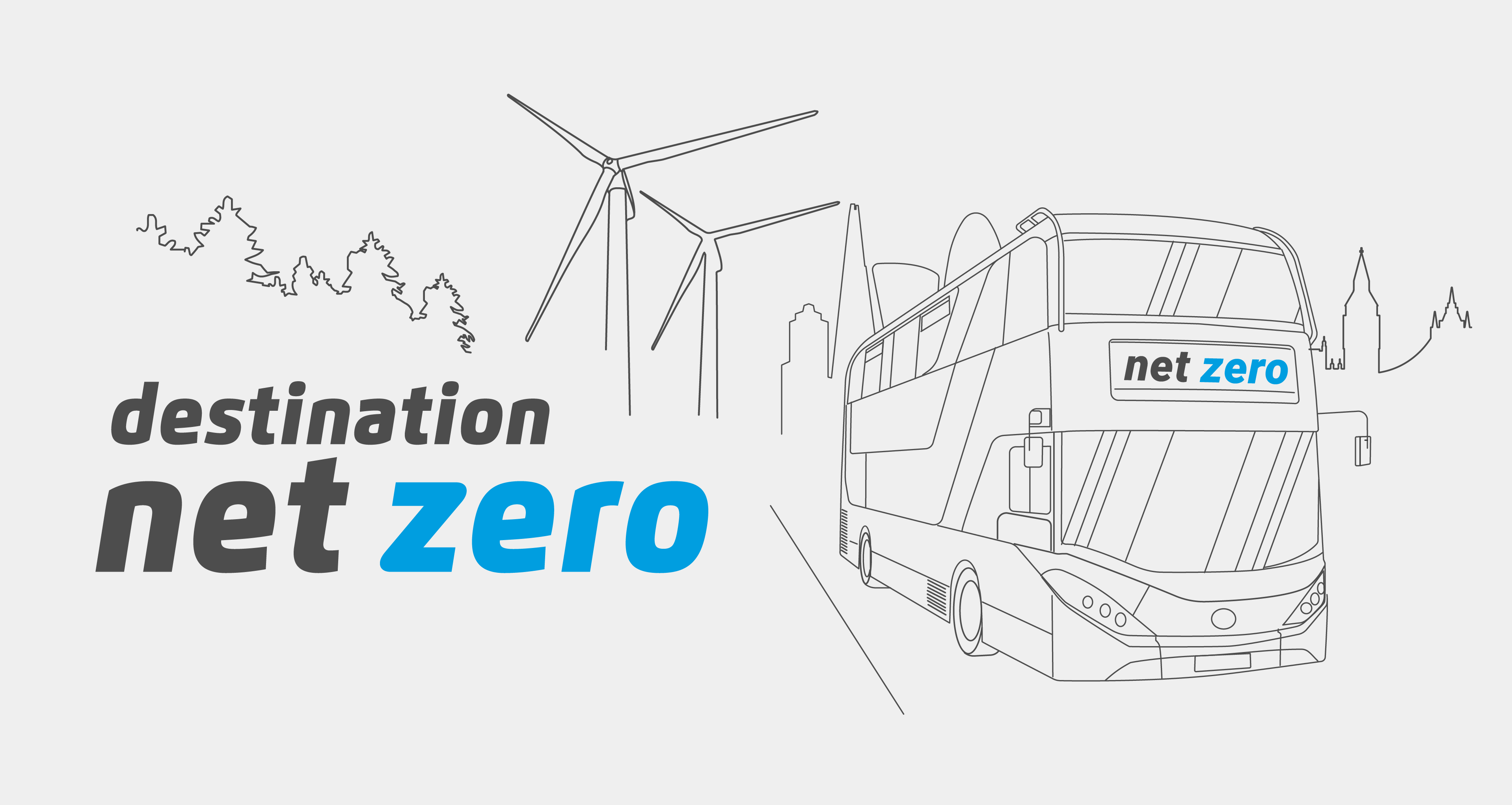
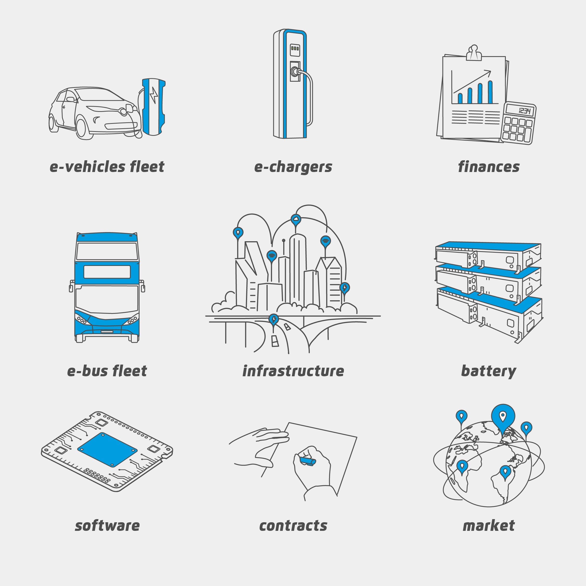
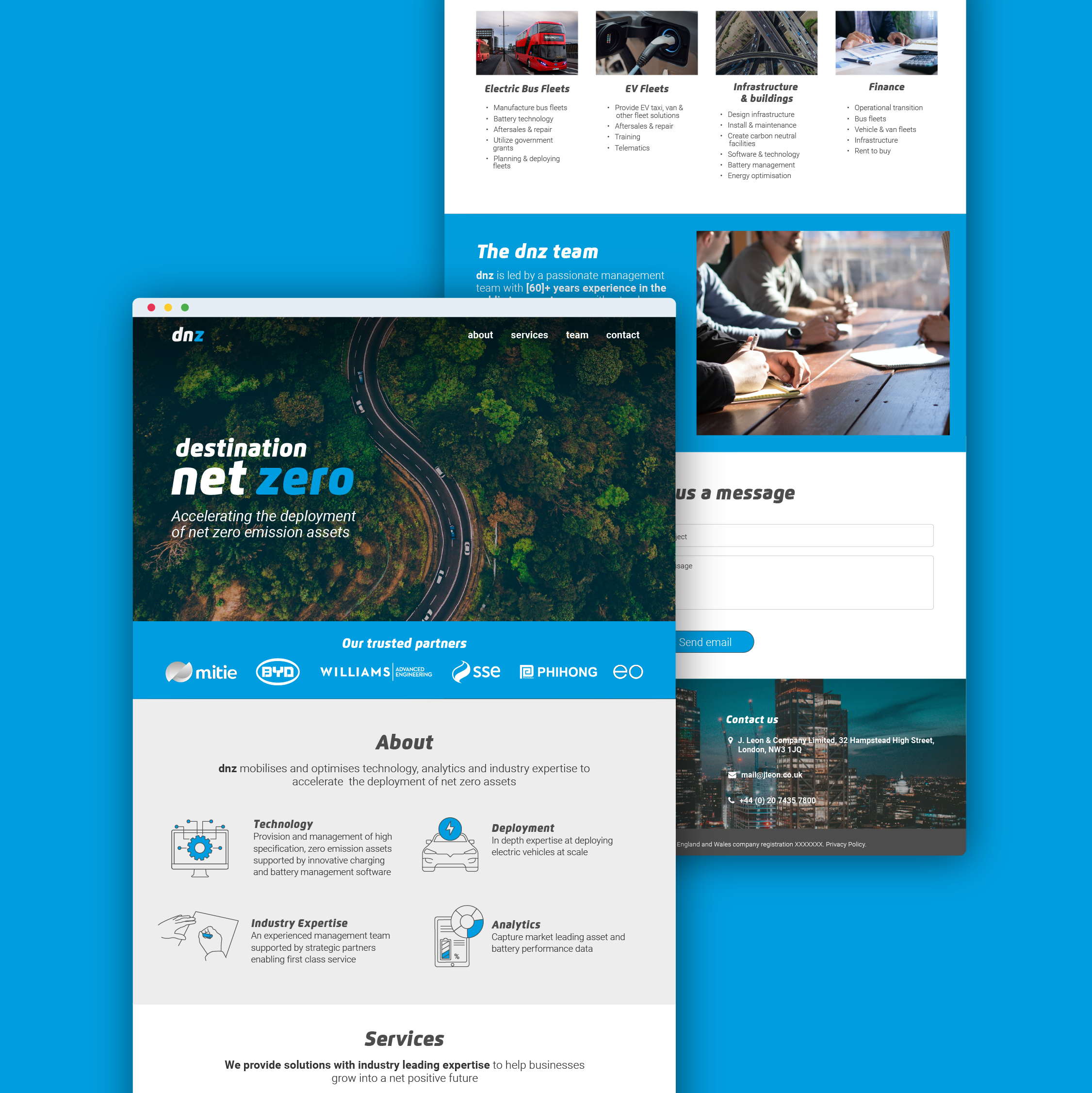

Destination net zero
Commissioned by the investment firm J Leon Group, Destination Net Zero was created as an ESG- and income-focused closed-ended fund, investing in EV fleets and infrastructure—starting with the UK transport sector.
The brief called for a primarily digital identity, so we developed a clean logotype, a bespoke set of illustrations, and the UX/UI design for their one-page website.
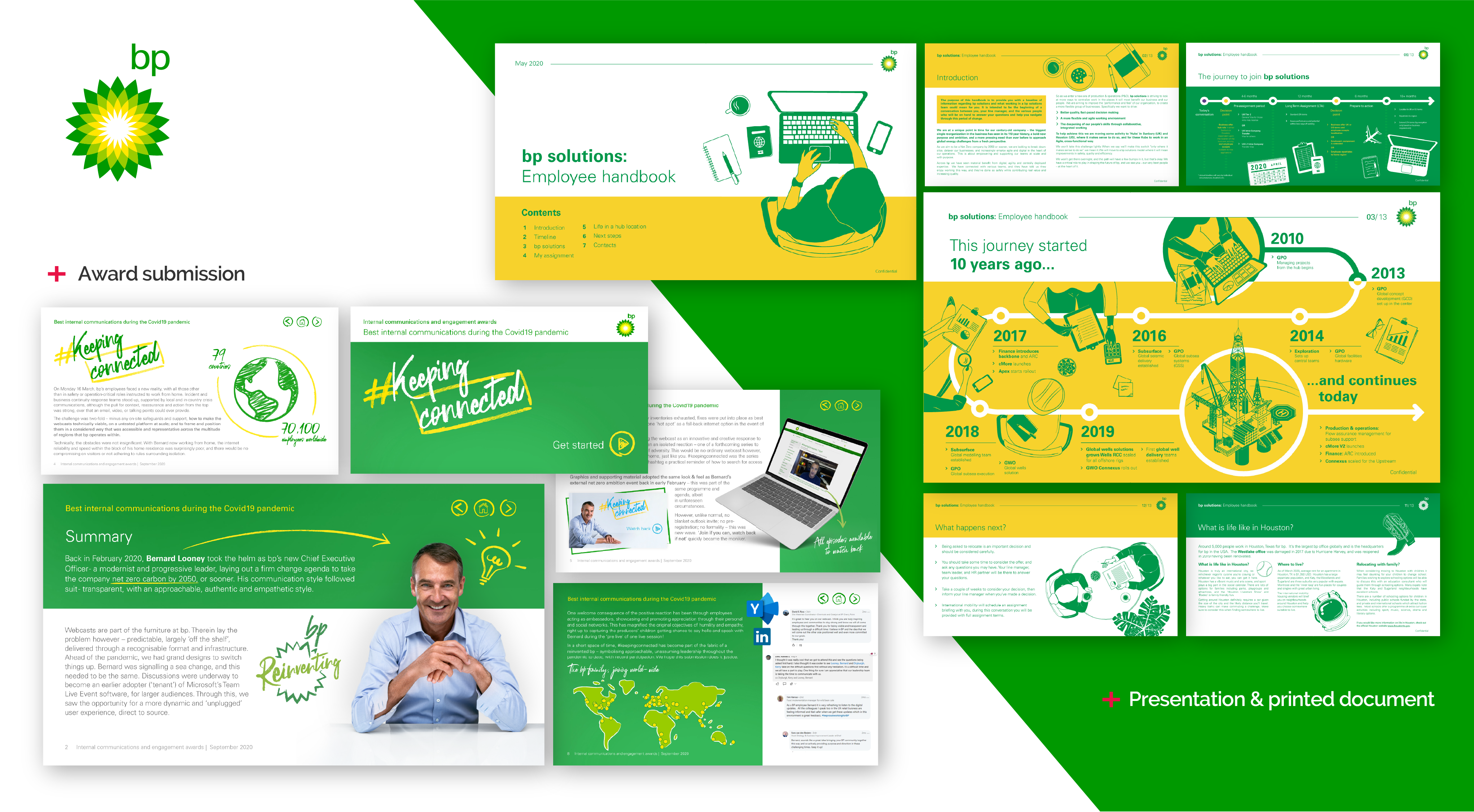
Retainers
The better we know your brand, the faster and more effectively we can deliver high-quality materials with quick turnarounds. Explore our work with bp to see how a long-term partnership fuels creative range and consistent results.